Lightroom for mobile is quickly becoming the go-to photo editing app for many photographers. With its intuitive interface and powerful tools, it allows users to make quick and easy adjustments to their photos in a matter of seconds.
By Matteo Martignago, cinematographer and colorist. Updated July 2026. I grade images for a living, which is where the tonal logic behind these sliders comes from. The free versus paid split, the feature list and every navigation path below were re-checked against Adobe’s current Lightroom mobile documentation in July 2026. The screenshots were captured in early 2023 and have not been re-shot, so please read the interface note before you follow along.
This Lightroom mobile guide will offer users valuable insight into how they can use this app to create stunning edits on the go.
This step-by-step guide will cover everything from the basics such as adjusting exposure and white balance, to more advanced topics like adding local adjustments or using selective color adjustment tools. It will also offer detailed instructions on how to take full advantage of features such as preset collections, image rating, and tone curve.
Whether you’re new to Lightroom or an experienced user looking to brush up on your skills, this guide has something for everyone!
Jump to what you need:
- Is Lightroom mobile free?
- The app looks different now: where each tool moved
- Cheat sheet: every slider on one page
- Importing photos
- The editing tools, one by one
- How to edit a photo start to finish
- What Adobe added since these screenshots
Before you start: the app looks different now
The screenshots here were captured in early 2023, on Lightroom mobile version 8. Adobe redesigned the mobile editing interface in October 2023 (version 9), and the app is now past version 11. What that means in practice: the sliders and their names have not changed, but the way you navigate to them has.
So the panels below are still the right panels, and what Exposure, Clarity, Dehaze or a radial mask does to a photo is exactly the same. Only the route changed. These captures were also taken with the app in landscape, so on a portrait phone the panels sit in different places on screen even where the panel itself is unchanged. Read the images for what each control does, not for where it sits.
This table translates the paths that moved, so you can follow any section of this guide on the current app. One I could not pin down: the old Auto button, which now sits inside the Light panel or under Quick Actions depending on your version.
| What you want | Where it was in 2023 (the screenshots) | Where it is now |
|---|---|---|
| Light, Color, Effects, Detail, Optics | Each had its own button in one flat row along the bottom | Tap Edit first, then pick the panel. They now sit one tap deeper. |
| Geometry | Its own button in the bottom row | Inside the Crop tool, as a Geometry tab |
| Healing brush | A button labeled Healing | Renamed Remove. Tap and hold it to reach Heal and Clone. Generative Remove lives here too. |
| Auto tone | Its own button in the bottom row | Inside the Light panel, or under Quick Actions. This is the one item Adobe’s current documentation does not pin down, so check both places in your version. |
| Crop | Bottom row button | Still on the main toolbar, but a later redesign rearranged the controls, so they sit in different places |
| Presets and Masking | Bottom row buttons | Still on the main toolbar. These are the easiest sections to follow exactly as written. |
| Quick Actions (one-tap AI edits) | Did not exist | A wand icon at the left of the edit toolbar. It appears in none of the screenshots below. |
| Star ratings and flags | Visible on screen | Behind the three little dots at the top right, under Info and Rating |
One item on this list is not a relocation. Editing in landscape orientation was removed in the 2023 redesign and has not come back, so if you learned to edit with the phone turned sideways, that option is simply gone.
A note on method: I checked all of this against Adobe’s current documentation rather than re-shooting 87 screens. Treat the images as a guide to what each control does, and this table as your guide to where to find it.
Import photos into Lightroom Mobile App
Before we jump on in and start editing our photos, I need to show you how to import them on the Adobe Lightroom mobile app.
There are two different ways you can import your photos.
1st Method
When you open the Lightroom app, the first tab that is going to open will be your library. In the bottom right-hand corner, there will be a little blue icon of a picture with a plus sign.
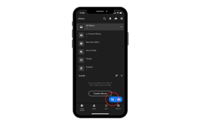
Let’s go ahead and tap that to import some photos. Once you do that, you will have the option to choose between the camera roll and files. If you take all your photos with your phone, importing them from the camera roll is probably going to be the only option for you.
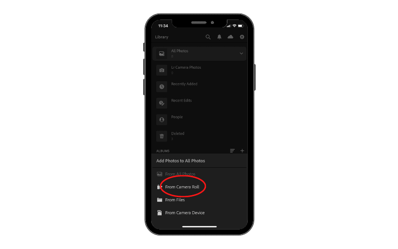
If you tap that, you can simply go through and choose any photos in your camera roll and add them to your Lightroom library.
To make this process faster, let’s click on the three dots in the top right-hand corner and check the box for “select mode“. This will allow you to select all the photos you want to import at once. Once you have selected all the photos you want, go ahead and just tap “add“. In this way, they will all appear in your library.


Now, if you either use a traditional camera with a memory card or have the photos saved on files, then what you need to do is click on the same icon and select “from files“.
Here you need to navigate to either your memory card (if you have connected it to your iPhone with an adaptor) or to the folder where you have previously saved all of your photos.
Once you have selected them, click add and they will appear in your library.
2nd Method
This second method is probably very unconventional and you are not going to use it often. Let’s say that you are in a situation where you are using a traditional camera with a memory card, but you don’t have an adaptor or a computer to upload your photos to.
Most digital cameras nowadays have built-in wifi capability, which basically means you can connect your phone to your camera’s wifi and transfer your photos over that way, straight onto your phone and then onto Lightroom.
This process varies from camera to camera so I won’t show it to you in this guide, but it is a very simple process and can be a lifesaver when you don’t have the right adaptor or a computer to upload them to.
Lightroom Mobile App Interface
Screenshots below are from early 2023, Lightroom mobile version 8. The flat row of tool buttons shown here was replaced by a two-tier toolbar in a later redesign, so use the path table in the interface note above to find each panel on the current app.
One important thing we need to cover before starting to edit our photos is to discuss and overview the layout of the app to familiarize with it.
So the first screen that opens up with the app is the library tab to all photos tab. The library tab shows us all the albums we have and all the photos we have previously imported. We can always create a new album for every project to keep everything organized. This is the tab where, as we saw previously, we can import our photos.
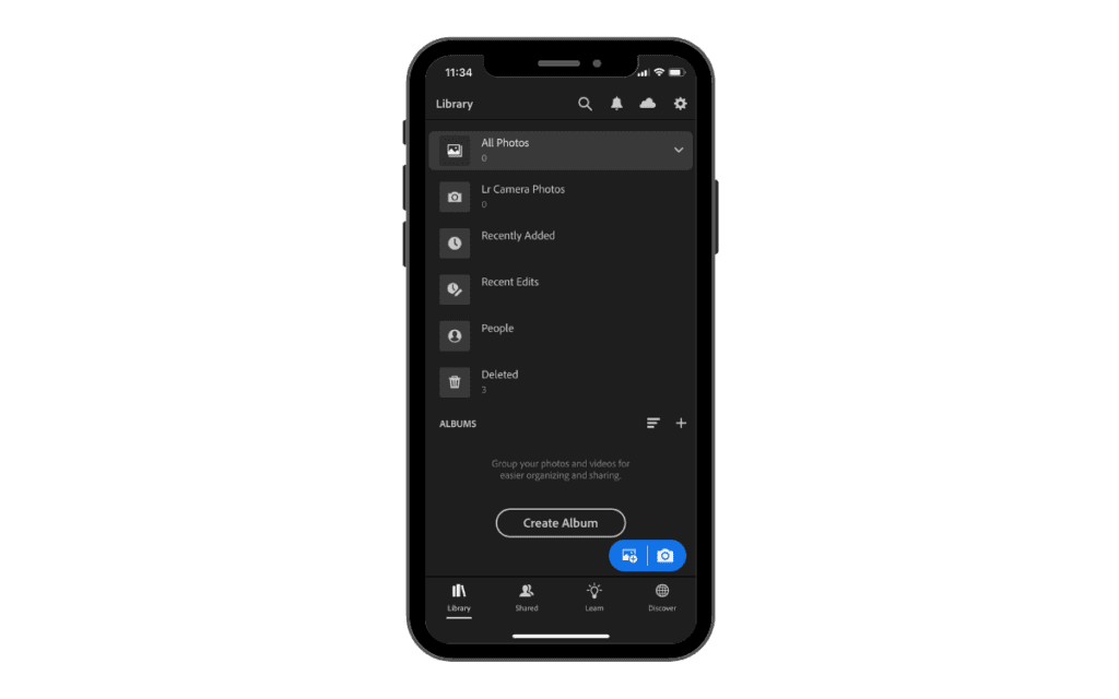
The “all photos” tab simply shows us all the photos we have imported in lightroom without differentiating any album. If we tap the little arrow in the top left hand corner, we will go back to our library.
If we stay in the “all photos” tab and click on the three little dots in the top right hand corner, this is gonna give us a little bit of control over what our library looks like.
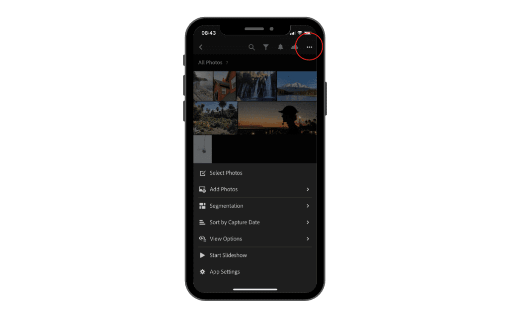
Select Photos
This option allows us to select multiple photos and add them at once into the edit tab.
Add Photos
This option allows us to import photos as we saw previously but instead of doing it from the “library” tab we are doing it from the “all photos” tab.
Segmentation
This basically allows us to organize and show our photos following several parameters such as the year they were taken or the month or even by file type (if we have both jpeg and raw files in the library).
Sort by
This option allows us to sort all the photos in the library by several parameters such as capture date, import date or file name.
View option
This setting allows us to edit the way your photos are previewed.
Start Slideshow
This option allows you to start a slideshow with all the photos in your library.
App Settings
This allows you to change some app settings. I have never touched this setting because there aren’t many parameters you can change and therefore I have always left everything how it was.
Edit Tab Settings
Now let’s click on any photos we have imported. The edit tab will open and some parameters will appear.
If we click on the 3 dots as we did before, we will have some different settings to choose from compared to what we just saw. In particular, we will be able to organize our photo and save it in a specific album or copy and paste settings or even create a preset to use on other photos later on.
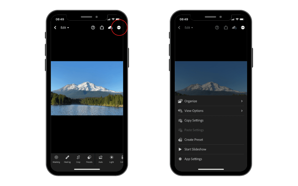
Going back to the edit tab, at the bottom we have a line of different tools we can use to edit our photos. We will go through each one of them individually later on in the guide.
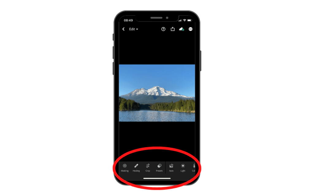
Starting with masking, we’re gonna make our way through every single editing tool, and you’re gonna learn how to use every single one properly to make stunning photos on your phone.
Lightroom Editing Tools
Is Lightroom mobile free? What you get without paying
Yes. Lightroom mobile is free to download, and the entire global editing stack is free to use: Light, Color, Effects, Detail, Optics, the Tone Curve, cropping, presets, the in-app camera, albums and export. A paid plan unlocks the tools that edit part of the frame, plus the generative and syncing features.
The rule is simpler than the feature lists suggest: adjustments that affect the whole photo are free, and so is capturing, organizing and exporting. Adjustments that target part of the photo, and anything generative, are paid, as are the ecosystem features like getting raw files in off a camera, batch editing and syncing across devices. Geometry is the one odd exception, a whole-frame tool that sits on the paid side.
| Free in the app | Needs a paid plan |
|---|---|
| Crop, straighten, rotate, flip | Masking and all selective adjustments |
| Light: Exposure, Contrast, Highlights, Shadows, Whites, Blacks, and the full Tone Curve | Remove, Heal and Clone (the healing family) |
| Color: white balance, Vibrance, Saturation, Color Mix (HSL) | Generative Remove and Lens Blur |
| Effects: Texture, Clarity, Dehaze, Vignette, Grain | Geometry and Upright corrections |
| Detail: Sharpening and Noise Reduction | Adaptive Presets and the Premium preset packs |
| Optics: lens corrections, chromatic aberration, defringe | Importing raw files from a camera or SD card |
| Presets: applying, creating, saving and importing your own | Batch copy and paste between photos |
| The in-app camera, including Pro mode and raw DNG capture | Syncing across devices, and storage past 5GB |
| Albums, ratings, flags, export, and HDR and video editing | Watermarking and Content Credentials on export |
The free tier is more generous than it used to be: since late 2025 it includes 5GB of Adobe cloud storage and lets you share public albums by link or QR code with no subscription. And a free account can still shoot and edit raw DNG files using Lightroom’s own camera; what needs a plan is importing raw files off a real camera or memory card.
Now that you know how to import and organize your photos and are a little bit familiar with the layout of Lightroom, let’s get our hands on the actual tools that we can use to edit our photos.
Two of the tools on that toolbar, Masking and Remove (the tool this guide calls Healing), are more involved, so we come back to them later. They are also both premium features, which is still true today: Adobe keeps anything that edits part of the frame behind a paid plan. Tapping one usually offers you a trial rather than hiding it, so you can see what it does before deciding. The table above shows exactly where the line falls, so you never hit a paywall by surprise partway through an edit.
Crop Tool
2023 screenshots below. Crop keeps all of these controls, but a later redesign rearranged them. Geometry now lives here too, as a tab inside Crop.
Once you tap on the cropping icon right away, you’re gonna see a little box appear around your entire image.
This is the basic cropping tool where we can just control the shape of our photo, but it’s going to stay in the original crop of the photo when it was taken. At the bottom of the photo, you can see a little zero with a degree. Right next to it if we tap and move right and left, we can change the angle of our entire photo.
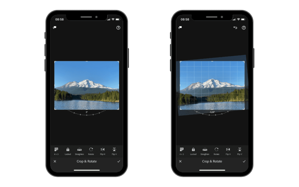
At the bottom of the screen, you will have some more tools to use. Starting from the left you will have the aspect ratio tool which allows you to choose I specific preset to crop your image.
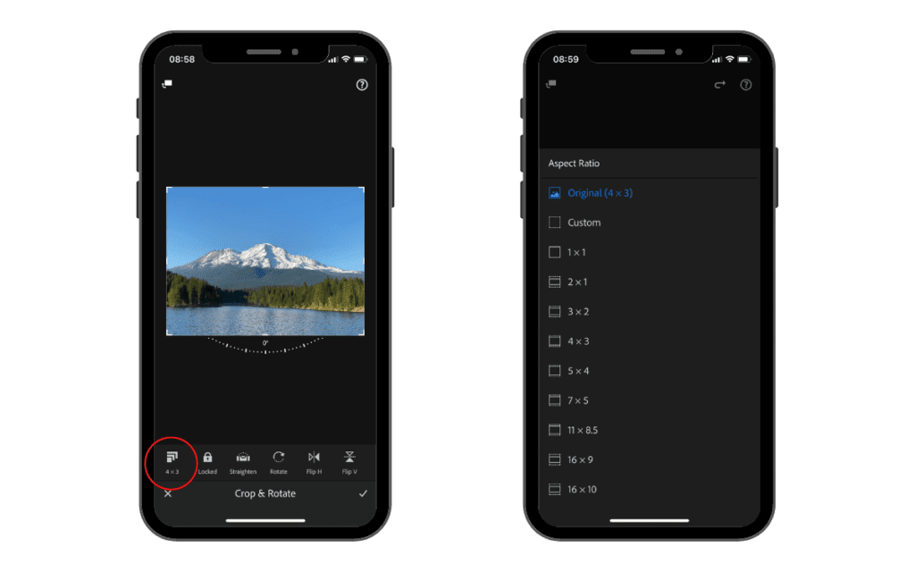
You can create custom crop presets if you need your image to have a specific dimension that is not already among the options in Lightroom.
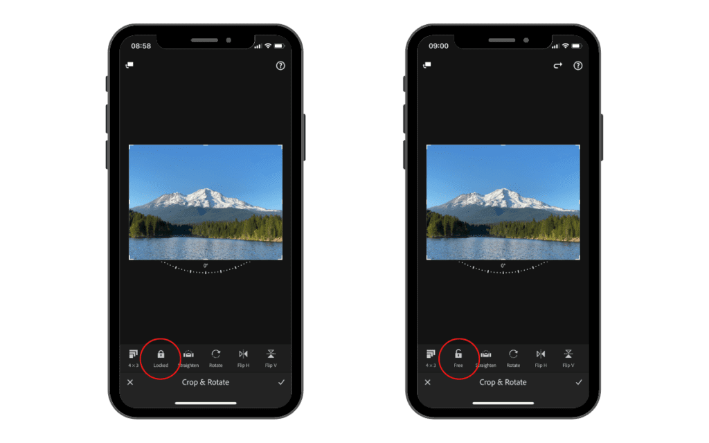
Next to the crop tool we have locked or free option tool. This basically means that when you manually crop an image you can either have all the axis locked and move together or free and you can crop any axis separately.
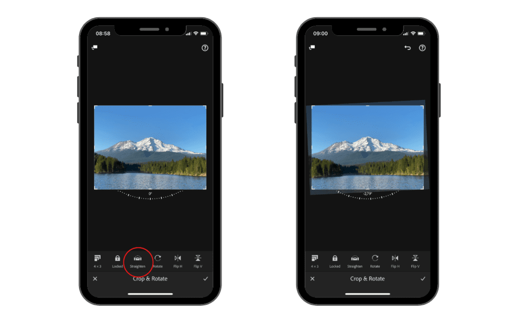
Then next to that, we have one of the most useful tools, which is the straighten. If you take a lot of landscape photos and your horizon is slightly off a little bit, if you tap that tool, Lightroom will do its best to straighten it out as smoothly as it can and make your photo completely leveled.
Right next to it, we have the rotate tool, which simply rotates our photo by 90 degrees every time we tap it.

Finally, we have the Flip Horizontal and Flip Vertical tools which basically will flip your photo on the selected axis (vertical or horizontal).
This is pretty much it when it comes to cropping in Lightroom.
Presets
The next tool we have is presets and it is the icon with the two overlapping circles.
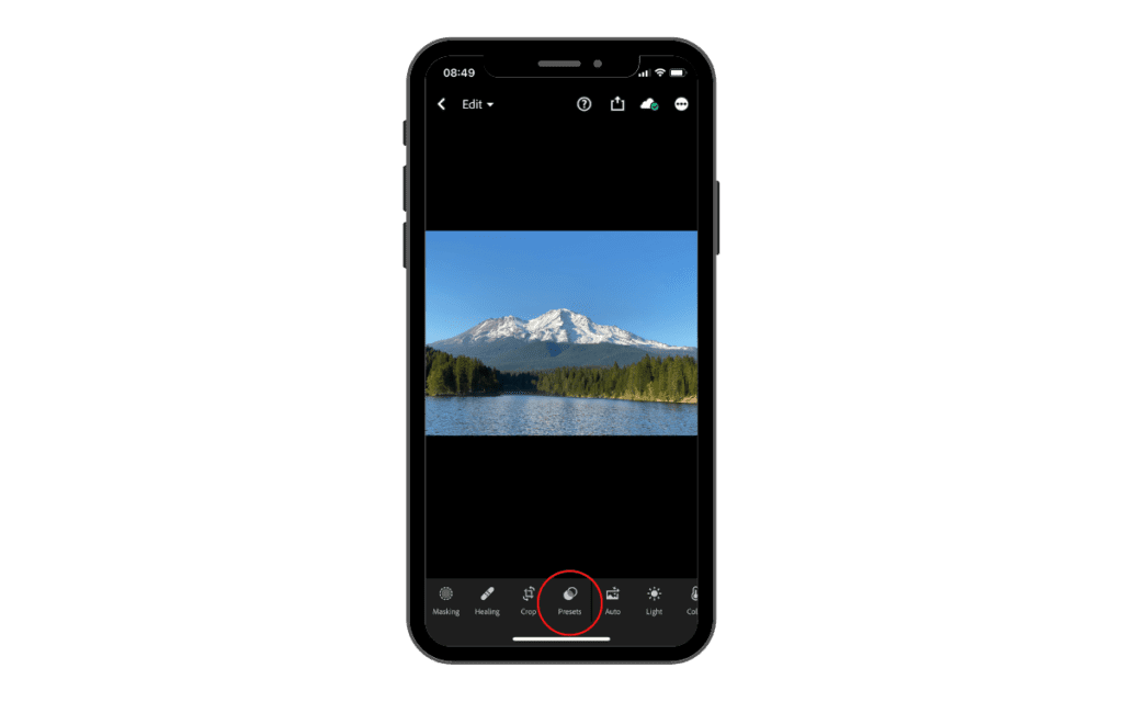
If we go ahead and tap that, this is basically going to bring up some filters that Lightroom gives you to choose from, that you can apply to your photos. I’m not a huge fan of using these because I think you can do a lot more by editing your photo from scratch and working your way up instead of throwing a filter on it.
But using a preset, especially one you have created, is a great place to start when editing your photos.
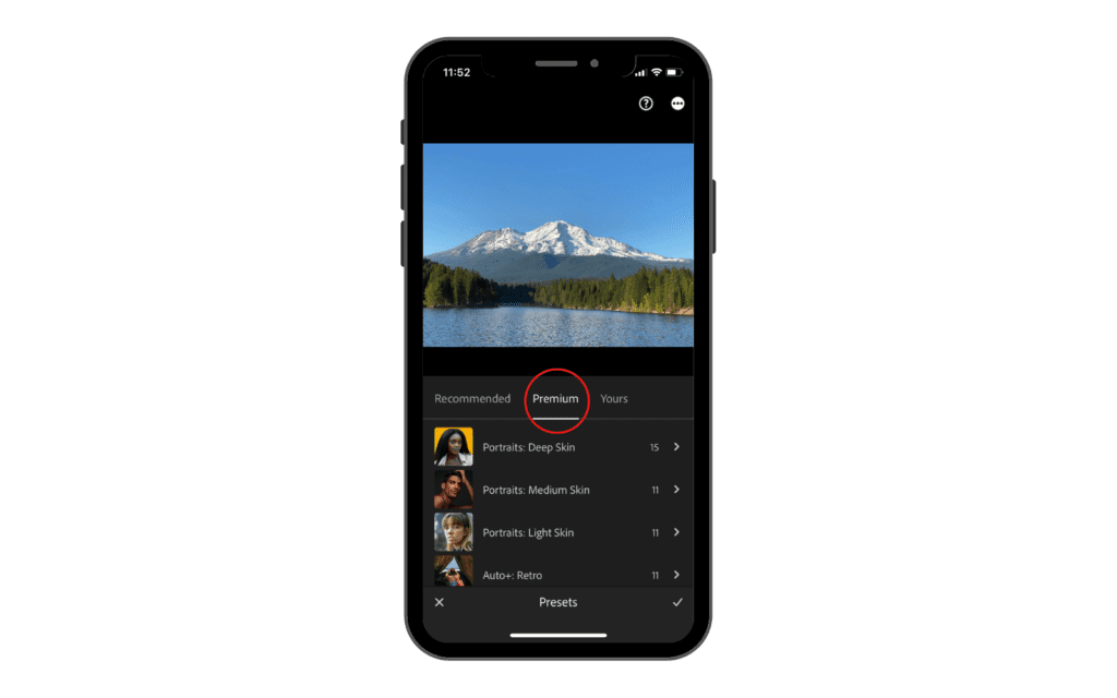
As you can see, there is a Premium tab of curated presets grouped by subject, like portraits, food or landscapes. Those need a paid plan. Everything else in the preset list, including the community presets and any you make yourself, is free.
Or if you tap on the recommended tab, Lightroom will show you a few presets that it recommends for your specific photo. And from there you can also filter through different types you want in the recommended presets, like subtle, strong, white balance and many more.

So that’s pretty much it. When it comes to presets, they’re really nice to use, especially when you’re first starting out using Lightroom mobile. You can just throw them on your photos and it makes a world of difference.
What I always recommend is to use them as a starting point rather than a finished product because every image is different and might need some adjustments.
Later on in this guide, I am going to show you how to make your own presets and create your own style and save it as a custom preset.
Auto
2023 screenshots below. Auto now sits inside the Light panel, and is also offered as one-tap Auto enhance under Quick Actions.
Now moving our way towards the right, the next icon in the tool section you are going to see is the auto tool.
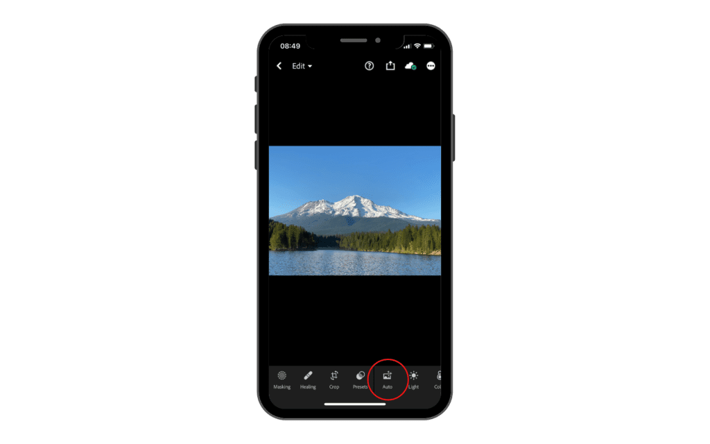
All this tool does when you tap it, is to automatically make some corrections to your photo that it thinks will improve it. So if your photo’s a little underexposed or overexposed, Lightroom is going to make a few minor adjustments and just give you a little help or boost to start out editing your photo.
I don’t usually like to use this in my final edit, but I do like to see what Lightroom suggests. So before I edit a photo, I will pop on the auto to see what it will look like and where the photo can potentially go.
If you want to see the before and after, you just need to tap and hold on to your photo and it will show you the original one. When you remove your finger it will go back to the edited one.
Light
These sliders make more sense if the relationship between aperture, shutter speed and ISO is already clear to you, which is what our guide to the photography exposure triangle covers. Editing exposure is the same logic applied after the shot.
2023 screenshots below. On the current app you tap Edit first, then Light. The sliders themselves are unchanged.
Next, we have the light tool.
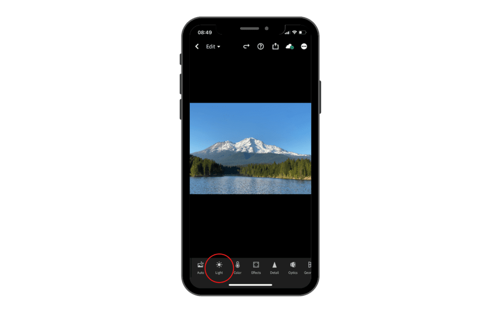
Now, this is where things get really hands on and your photo will change a lot depending on what you adjust. So let’s go ahead and tap the light icon. When we do so, some parameters are going to appear that we can use to adjust our light in different ways.
First, immediately to the top right, we have this little box with a line in it. This is the tone curve.
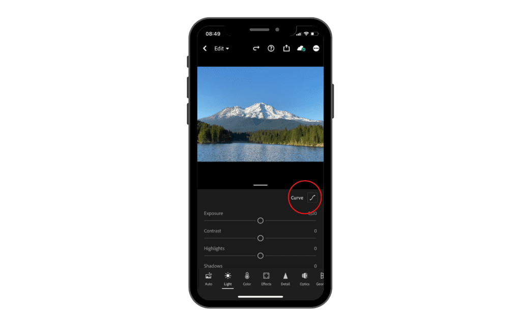
If we tap it, a graph is going to open up where we can adjust our exposure and contrast manually. The most popular curve to use in this graph is the S Curve which basically increases the contrast and the highlights a little bit, making the photo more dynamic.

On top of that, you can also use the curve to select specific colors (Red, Green and Blue) and adjust their value singularly. Let’s say for example that you took a picture and there is a lot of green in the overall picture and you want to bring it down a little bit to balance the image.
What you can do is select the green color in the curve tab and from the middle bring it down a little bit just to remove the green levels. You can do the same with the other colors as well.
Now, let’s move to the bars we saw when we tapped on “light”.
First, we have exposure, which is pretty simple. It just changes the exposure of your photos. So if we drag it up, it’s going to make our photo brighter, and then if we drag it down, it’s going to make it darker.
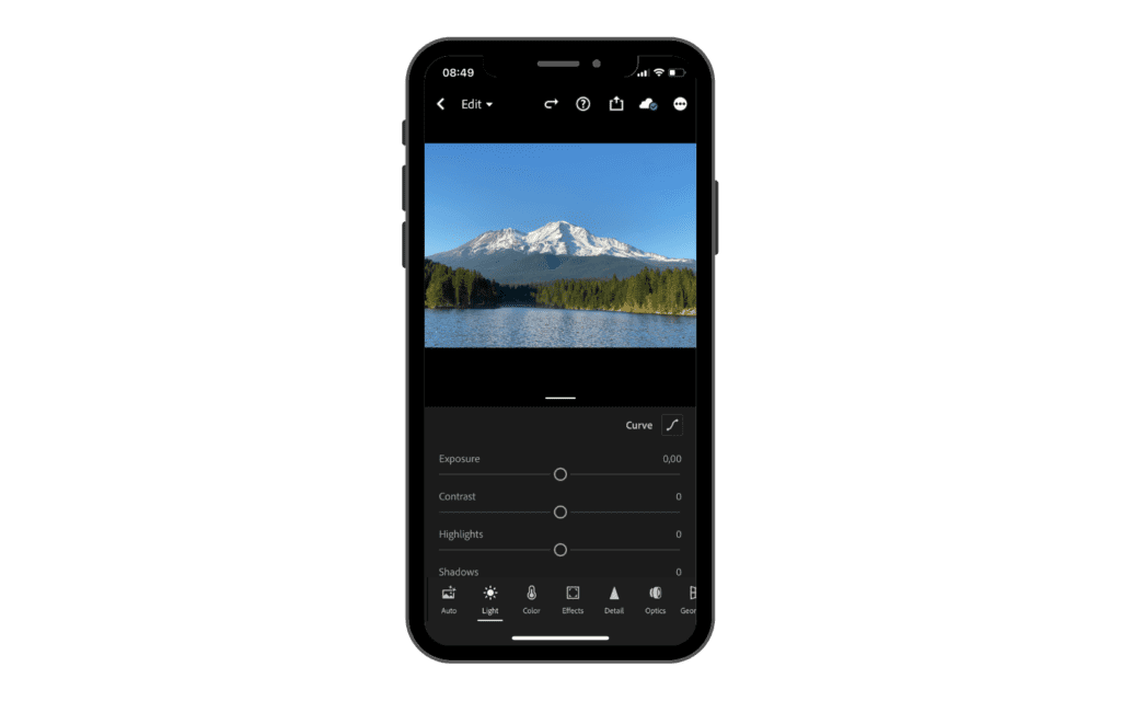
So basically if you take a photo and it was a little under or overexposed, you can use this bar to adjust that. If you drag it too much, either way, it is going to underexpose or overexpose your image.
Next, below exposure, we have contrast. If we drag it to the right, it is going to increase the contrast of our photo, including the highlights and shadows and colors. If we drag it left it is going to decrease the level of contrast in our photo.
Right underneath, we have highlights. If we drag it to the left, it is going to decrease the exposure of the highlights only. This is very useful if, for example, we have the sky that is too overexposed compared to the rest of the image.
If we drag it to the right, it will increase the exposure of the highlights only.
Now we have shadows. If we drag this towards the left we are going to decrease the exposure in our shadows and therefore they are going to be darker and maybe underexposed and vice-versa.
Next, we have whites and blacks. These are similar to highlights and shadows but the difference is that they will only affect the white tones or black tones of the image without changing the opposite. So, for example, if I am increasing the whites, it won’t affect the image in other parts that are not white tones.
Color
2023 screenshots below. On the current app you tap Edit first, then Color.
Moving to the right we have the color tab. Color theory is a very important aspect we need to master in order to get the best out of our edit.
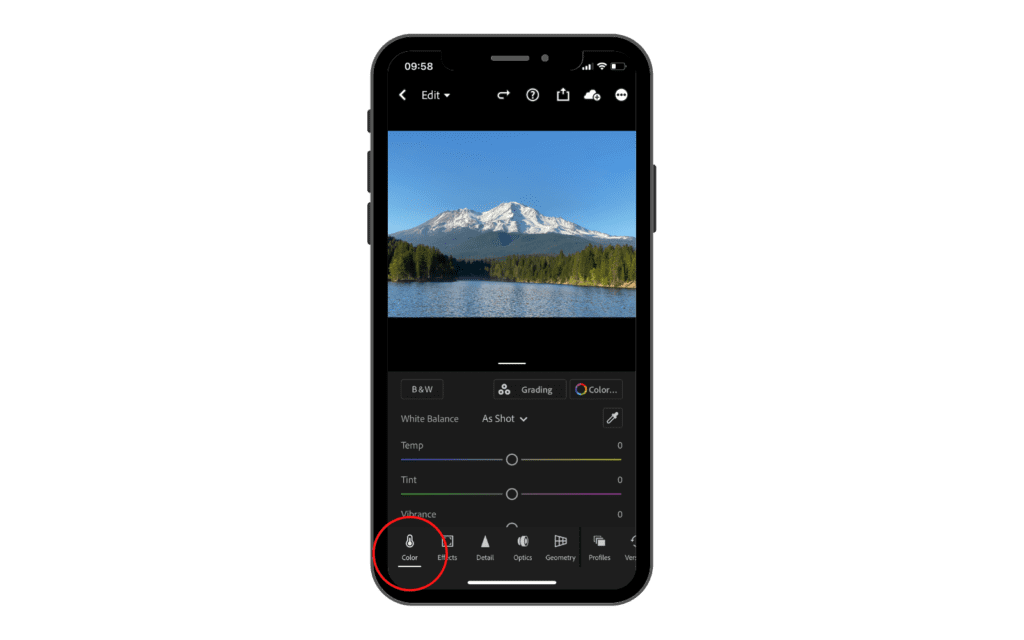
Here we have several settings that we can change to edit our images.
First of all, we can automatically make our photo black and white. To do so we just need to tap the little icon that says B&W. You can tap it again to go back to color.

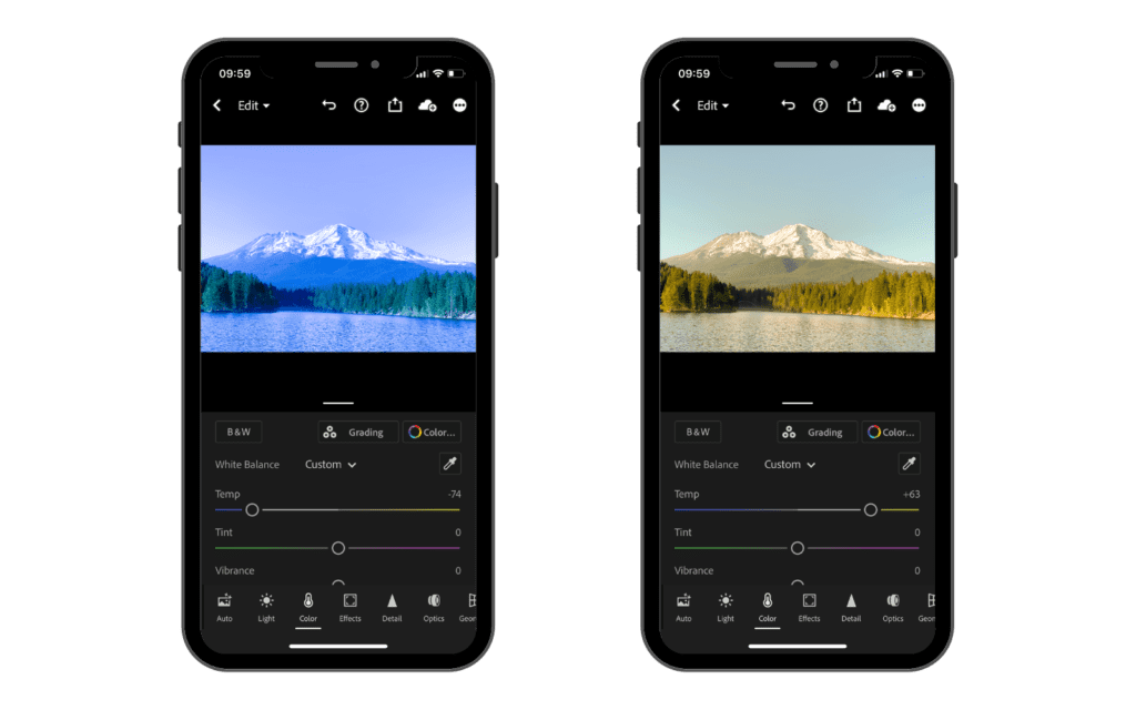
Below, we have several parameters to change the colors in our photos. The first one is Temp. This setting allows us to change the temperature of our photo, making it either warmer or colder (basically you can use it to change the white balance).
So if we go ahead and drag our finger, we can control how warm it is. If we drag it to the right you can see our photo becomes very warm. And then if we drag it over to the left, our photo becomes very cold.
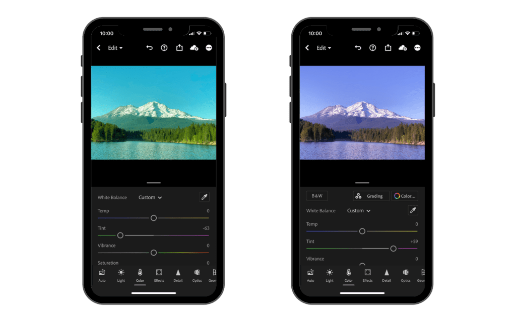
Next, we have Tint, which is basically the same thing as Temperature, but for green and purple.
If we drag it over to the right our photo becomes more purplish pink. If we drag it over to the left, our photo becomes greener.
Then we have vibrancy and saturation. Now, this is where things can get a little bit confusing. When people edit their photos, they really like to bump up that saturation and make their photos look a lot more colorful, which is not a bad thing but we need to understand how both work to use them at their best.
While both tools are used to enhance colors in an image, they work in different ways.
Saturation refers to how vivid or intense a specific hue appears in an image. Increasing saturation will make colors more vivid while decreasing it will make them less intense or muted.
Vibrance, on the other hand, increases intensity but with greater care for preserving skin tones and other delicate hues in an image. This means that it can be boosted without making certain colors look overly saturated or artificial-looking.
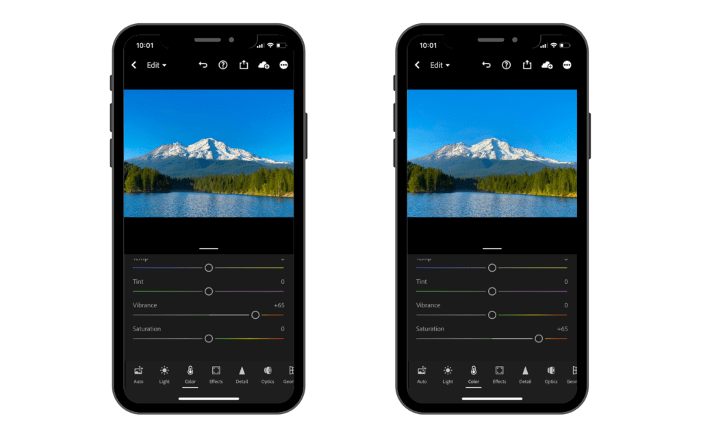
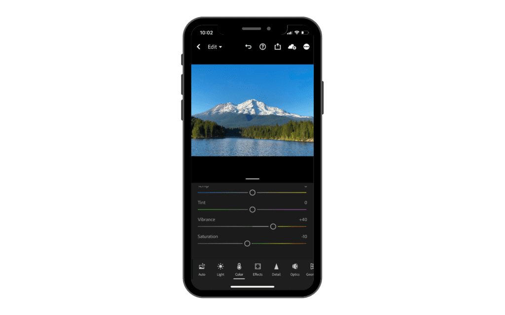
What I like to do is bring the vibrancy up a little bit and then bring my saturation down a little bit as well to balance the image better.
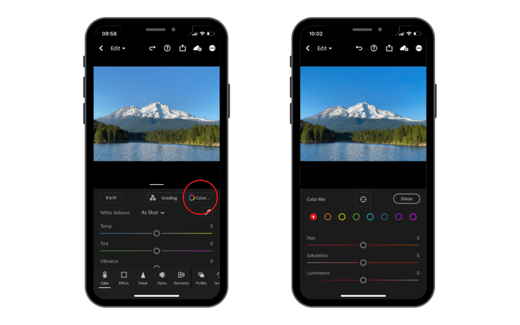
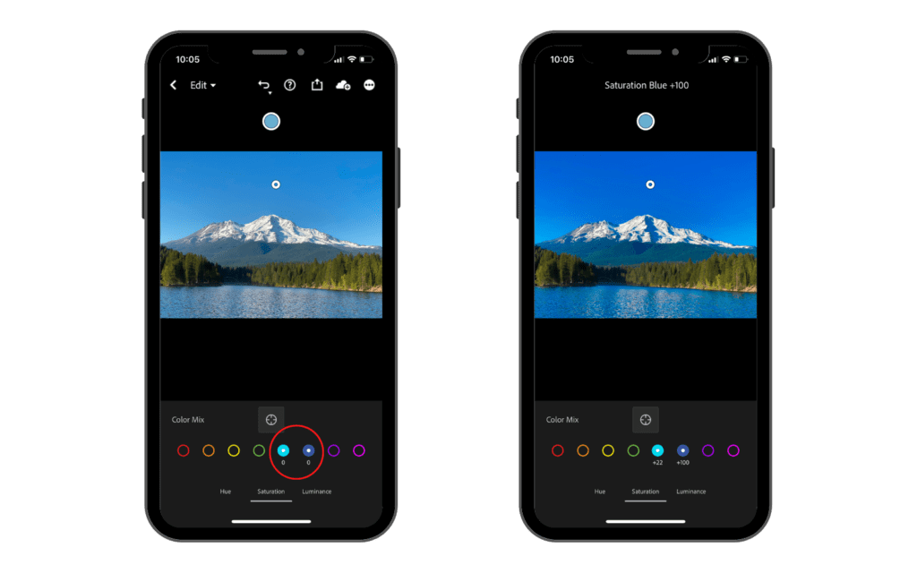
Going back up, in the right-hand corner we have a color wheel that indicated the color mix. So if we go ahead and tap that color wheel, it will bring up our color mix and basically we can tap any of the colored circles and we can manipulate that color in our photo without affecting anything else.
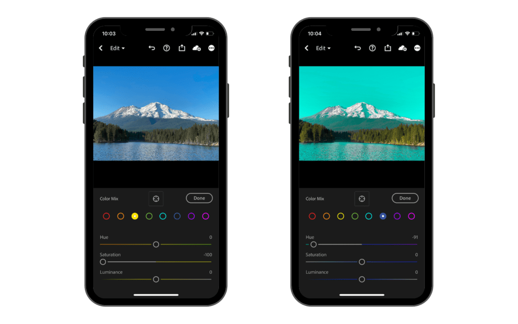
So, for example, if we go ahead and tap yellow and take the saturation down, you can see all the yellow on our photo gets very muted and the saturation starts fading away. If we go ahead and select a blue and pull the cursor to the hue over to the turquoise side, you can see that the blues in the picture will start to change color.
Let’s say that there is a color in your photo that isn’t on one of these circles. It is kind of a weird color. Well, you can go ahead and tap the little icon in the middle that kind of looks like a scope, and you can tap your finger on a color.

You can select to change the hue, saturation or luminance. Once you put your finger to the desired color in your image you can drag up and down or left and right to increase or decrease the value that you selected.
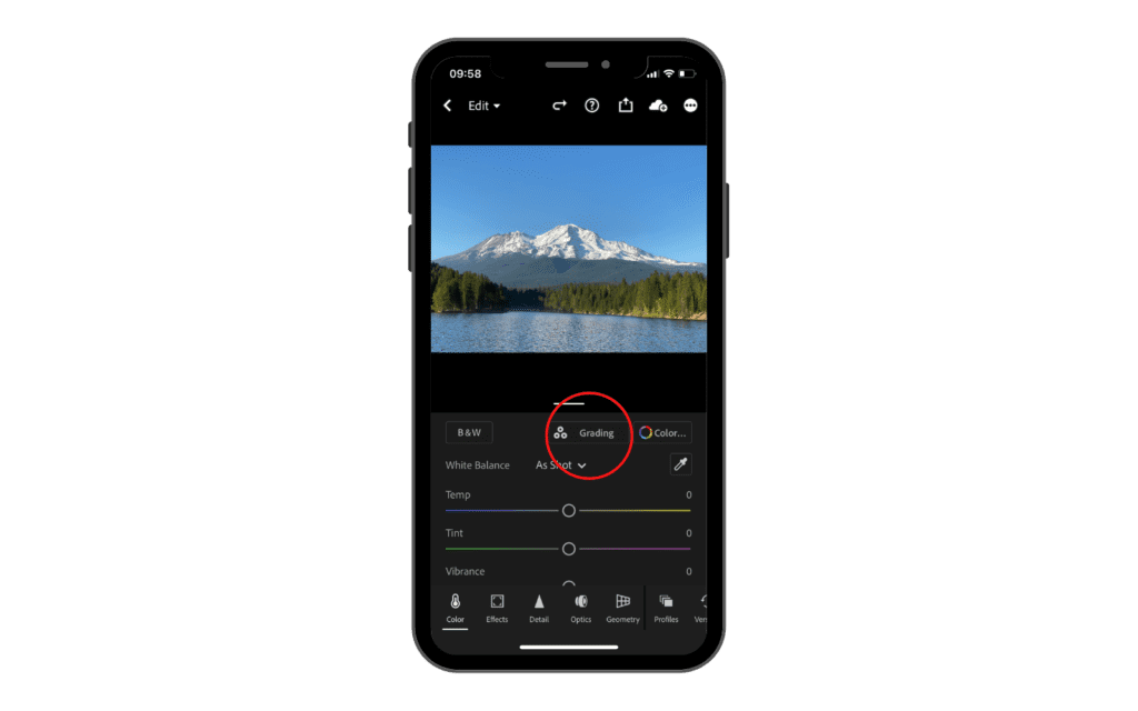
Finally, we have the color grading. Now, if we tap color grading, you are going to have 4 different color wheels to work from. Each color wheel acts to specific tones. Starting from the left, the first one is the shadows, the second one is mid-tones and the third one highlights. The fourth wheel is a global wheel that will affect the whole image.
Let’s say for example that we want only to edit the colors in the shadows making them cooler. To do so we would need to drag our finger from the middle of the wheel toward the blues on the left side. Doing so will add some blue only in the shadows of our photo.
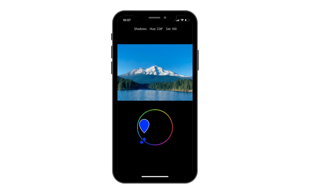
Below we can change the luminance of each wheel, which is simply the brightness of every adjustment. Blending refers to how subtle this change is. Since it affects, in our example, only the shadows, changing the blending would help to make shadows and mid-tones, for example, blend more smoothly. Balance basically regulates the amount of change in the image. If you scroll to the right you will have less impact in your photo whereas to the left you will have more.

Effects
2023 screenshots below. On the current app you tap Edit first, then Effects.
Next in the list, we have the Effects tab. This is where we can make some big changes to our photo.
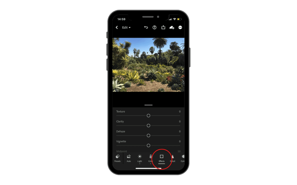
The first thing we have is Texture. Basically, Lightroom is just going to take the textures and just make them look a bit more texturized.

Next, right under that we have Clarity. It is a mixture between texture and contrast. So if we pull our clarity up, you can see the overall photo just looks a lot sharper, punchier, and more contrasty.

Next, we have Dehaze. This tool isn’t used too often but in particular situations, it comes in pretty handy. Let’s say that we took a photo during a foggy day, this tool helps us to get rid of some of that fog.

Moving on, we have Vignette. This is just going to make a shadowy ring around your photo or light ring depending on if you are dragging the cursor right or left. I never use the light vignette but I think that a very sudden shadowy vignette can really help a photo.
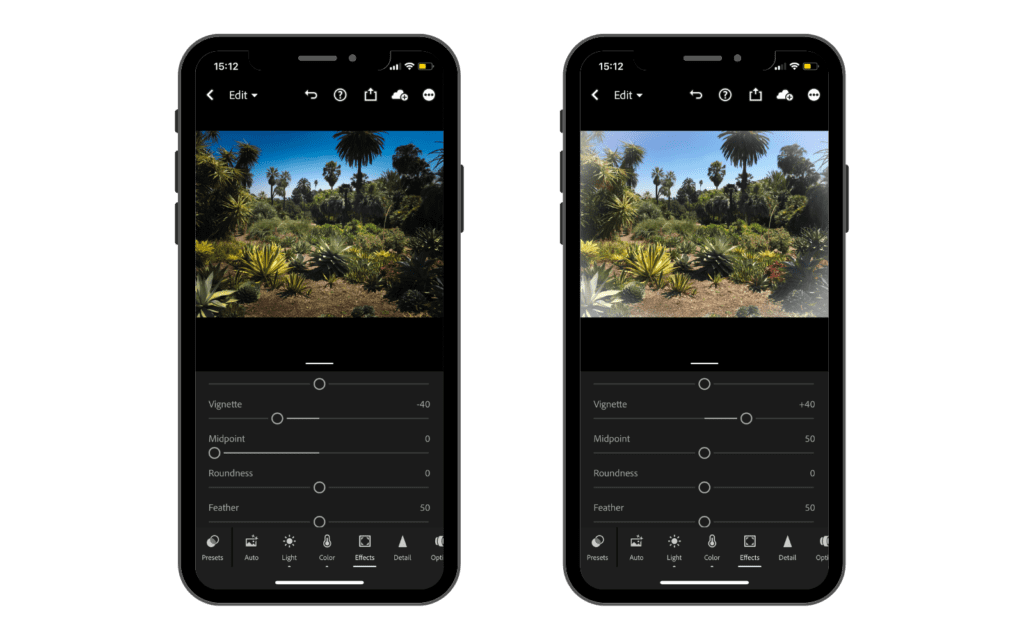
Once you add a vignette below that, you can control the midpoint. It basically refers to how wide or narrow the midpoint is from the center of the photo.
You can then control the roundness of it if you want it to be very round, or if you want it to kind of stay over in the corners. You can choose how much you want it to feather so you can have the edges be super sharp or you can have it feather out a lot, which I think looks more natural.

And if you do choose to add a vignette, you can also control the highlights in the shadows of the vignette. So instead of it just being really dark around all the edges, you can up the highlights so they stand out a little bit more.
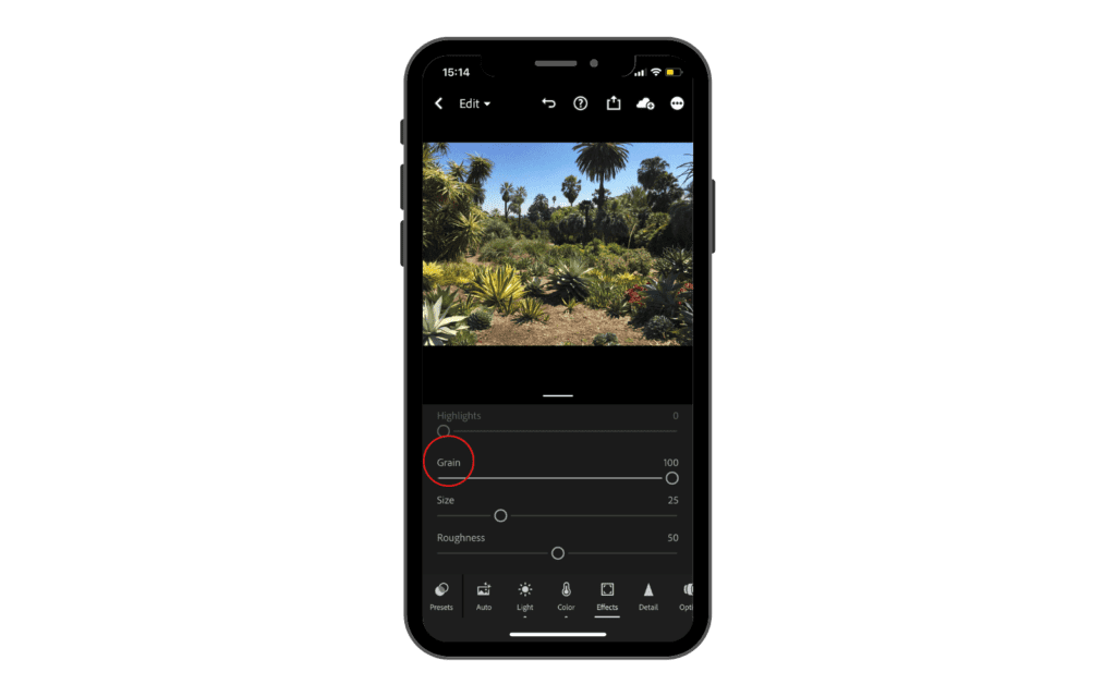
Last we have Grain. It basically adds some film grain over your photo. Once you add some grain you can then choose the size and the roughness, which is basically how sharp the grain is in the image.
Detail
The caution below about noise reduction is from 2023 and it still applies to this slider. Adobe has since added Denoise, a separate AI pass that rebuilds detail instead of smoothing over it, and it is the better tool for a high ISO file.
The next section of tools we have is detail. This is an area I don’t actually spend a whole lot of time when it comes to editing my photos. But if we go ahead and go into the detail tab, you can see we have a few different settings that we can adjust, such as sharpening, masking, radius and noise reduction.
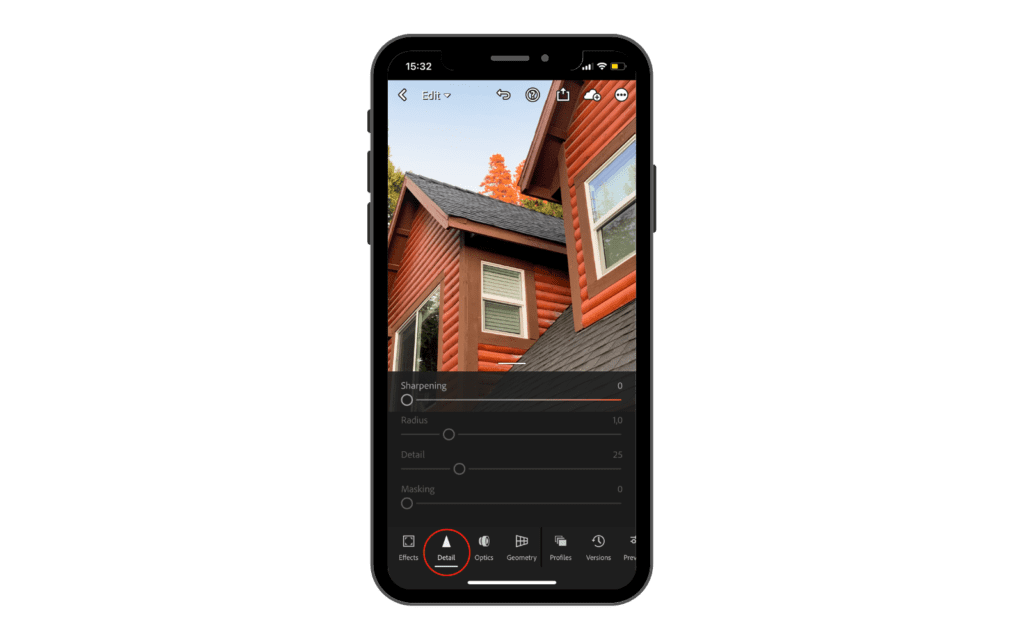
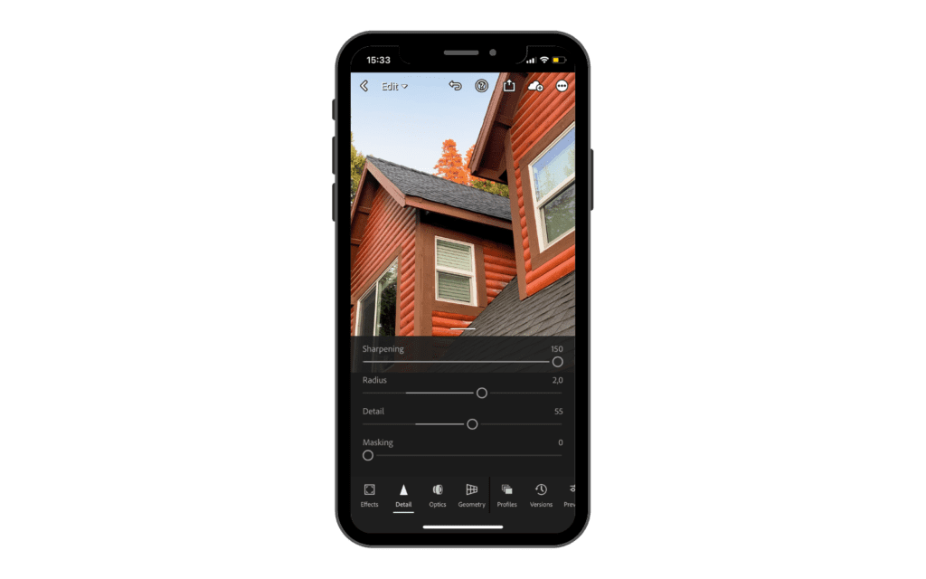
Now, I don’t use these a whole lot, but they’re pretty self-explanatory. Things like sharpening and detail are just going to make your photo look a bit more sharp and bring out the details a little bit more, but I tend to stay away from these, not because I don’t like them, but because I think the clarity tool just does a better job and it takes care of it a whole lot better.
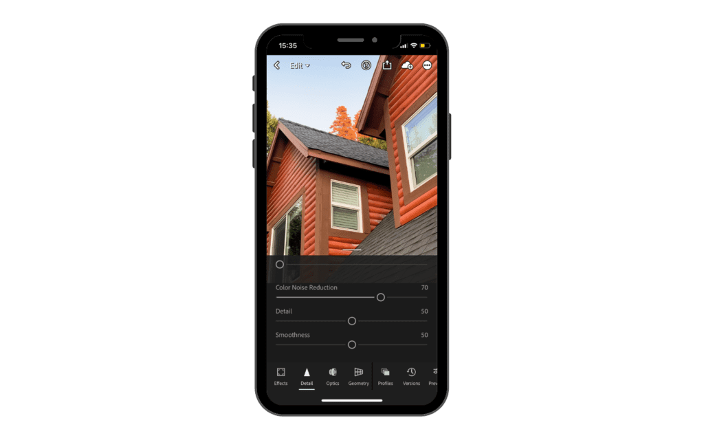
Just below that, we have noise reduction and color noise reduction. Now, these are two very helpful tools that you can use to eliminate some of the noise in your photo.
Now, if you don’t know what noise is, noise is that little grainy pixely particle stuff you see in your photos, and this occurs when you take a photo in a low light condition and your ISO is a little bit too high. That’s when you’re gonna see this weird kind of colorful TV static fuzz in your photos.
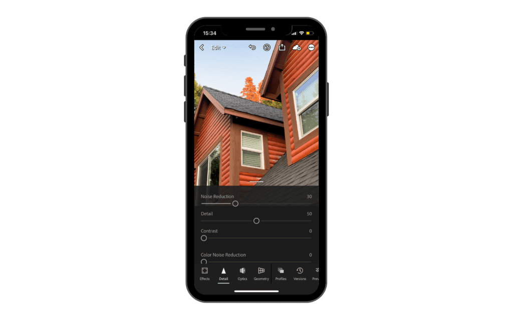
Using the noise reduction tool can be good, but you don’t want to use it too much. That’s mainly because of the way Lightroom removes it. What it does is find the noise in your photo and it blur it out. It doesn’t actually get rid of the noise, it just kind of covers it with some blurriness or smoothness.
So if you go ahead and bring noise reduction up to 100, you can see how the photo looks really smooth and it almost looks like a painting, and as a consequence, you lose a lot of details.
Under that, we have color noise reduction. This tool is less sensitive compared to regular noise reduction and you can use it as much as you want because it gets rid of the color in your noise. There are little colorful particles in the noise and this tool is just going to eliminate that and it’s not gonna smooth it over.
Masking
Now that we’ve covered all the basic tools in Lightroom, let’s go ahead and go back to the beginning of the list where we skipped over the masking tool and the healing tool. Now, I should let you know if you don’t have the paid version of Lightroom, you won’t have access to these tools, but you can still edit amazing photos without them.
So if we go ahead and tap the icon of the gray circle with the dotted line around it, this is going to bring up our masking tool. The masking tool works in a way where basically you are creating multiple layers where only certain things are going to be affected when you change the edit.
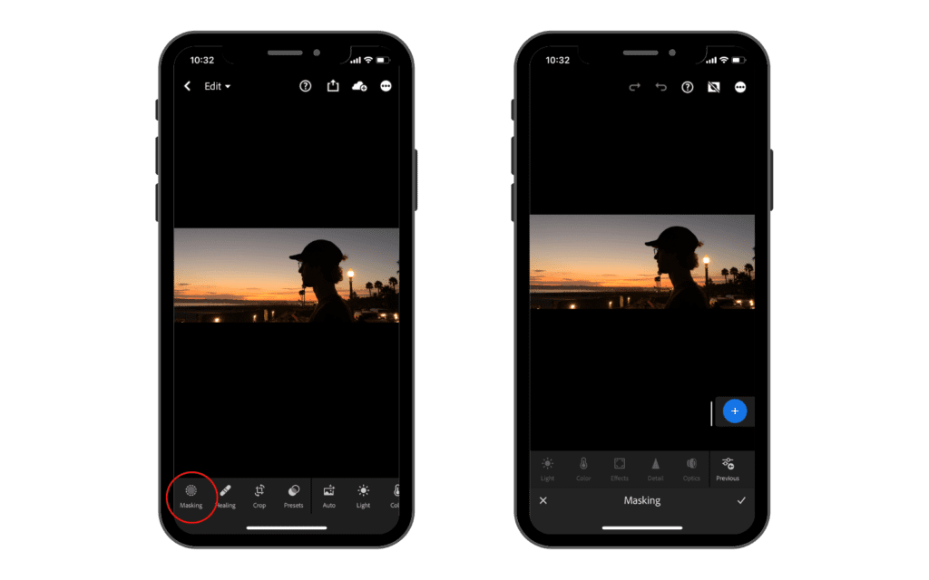
So if we go ahead and tap this blue circle with a plus in it, we will have a bunch of different options that we can choose from to create a mask.
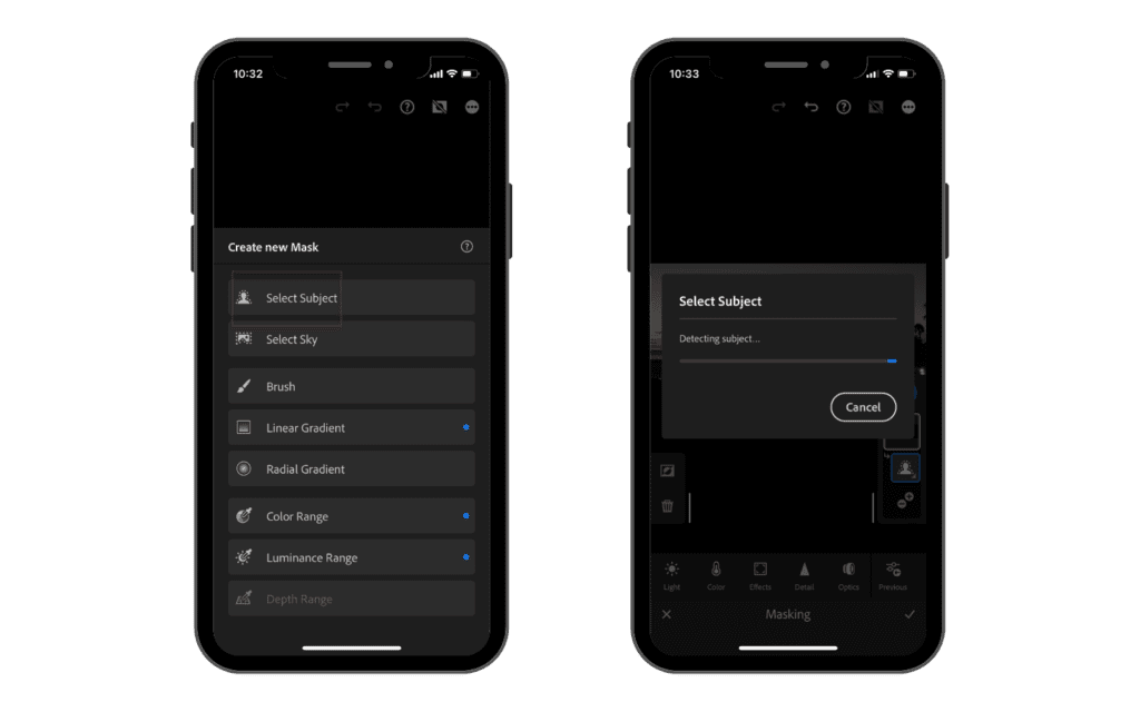
So let’s go ahead and do select subject. Once we select the subject option, Lightroom is going to do its magic and find what it thinks is the subject in the photo, and usually it does a pretty good job.
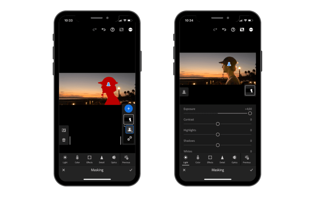
So now you can see how the subject is highlighted in red. This is just showing you what is selected. The highlighted area is the only part of the image that is going to be affected when you make an edit. So if we go ahead and tap “light” and bring our exposure up, you can see that only that area is being affected.
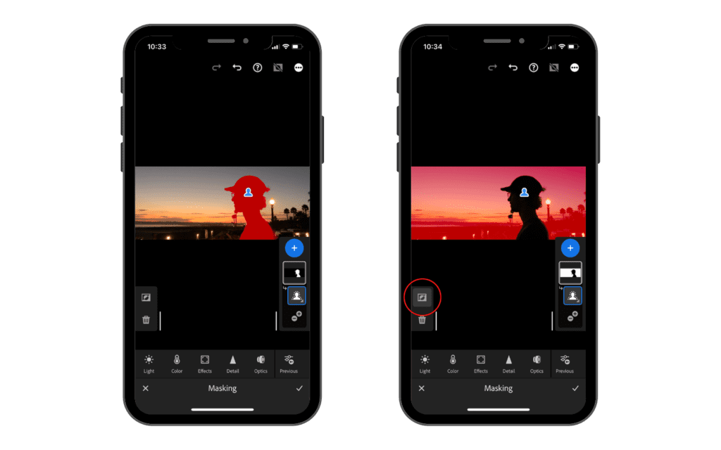
Let’s say that you what to select everything but the subject. In order to do that, you can use the select subject tool and once it’s done selecting, you can click on the mask on the right side and on the left side you will have this “invert icon” (a square with a circle cut in the middle).
If you tap on it, Lightroom is going to select everything outside the subject mask. So if you do an edit, it will only affect the outside part we just selected.
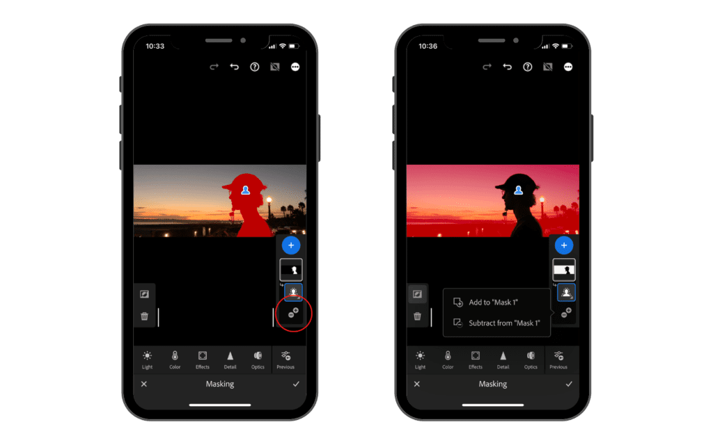
Another way to adjust the mask and exclude a portion of what we have just selected, we have to use the “subtract from” option. To do so, we need to tap on the plus or minus option and there select the “subtract from mask 1” option. Then we need to select the tool we want to use to exclude the part of the selection we don’t want to affect without edits.
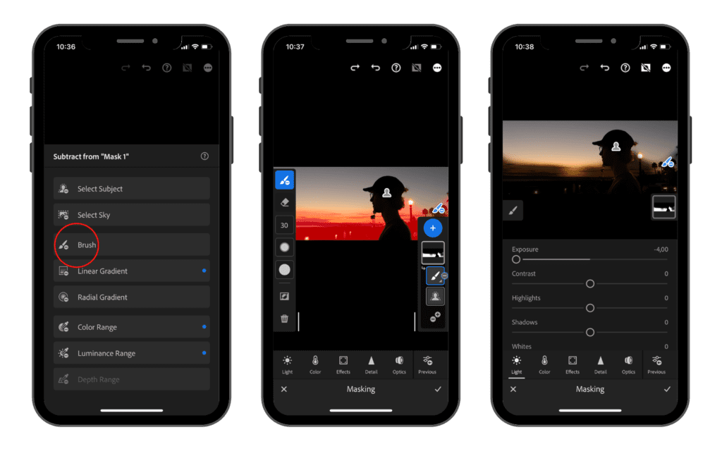
Let’s say that we select the brush tool to subtract from the mask. Once you have the brush selected, you can then choose how big you want it or how soft you want the edge to be. Then simply just use your finger in color in the area that you do not want to be affected in this masking layer.
Once you’re finished, go ahead and just tap done, and then if we go back into that masking layer and change the exposure you can see that the portion we just selected is no longer a part of that masking layer.
The other masking option we have after is Select Sky, which is basically the same exact thing, but Lightroom finds the sky in your photo and selects that and creates a masking layer. If your sky is overexposed, you can easily change the exposure and make your sky look much nicer and dramatic or bluer.
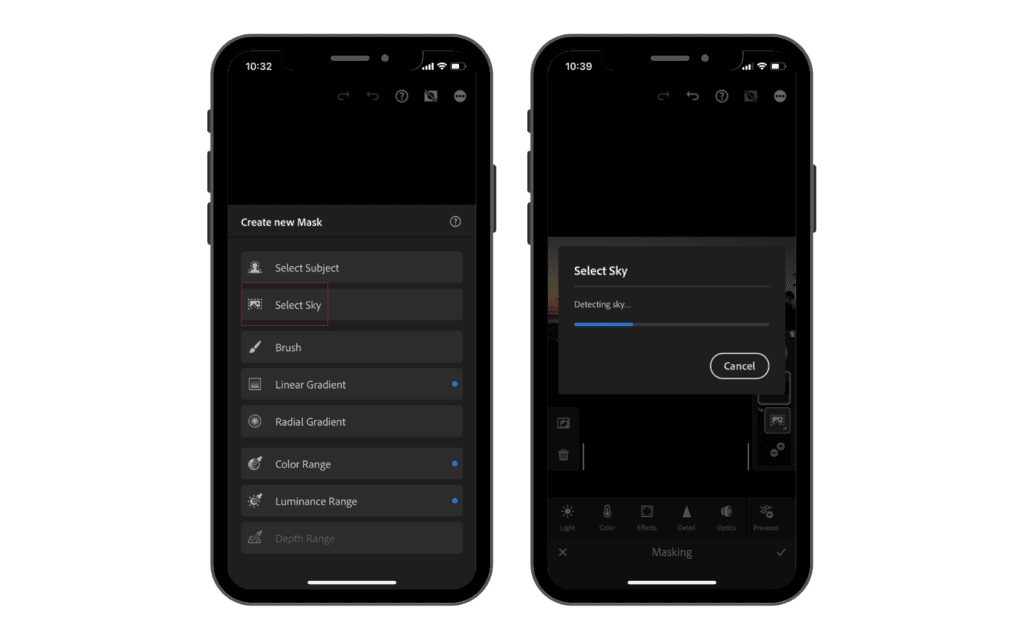
Below that, we have the brush, which is what we just used to get rid of some of the masking layer on the subject layer. You can just use a brush in color in any area you want, and it’ll become a layer.
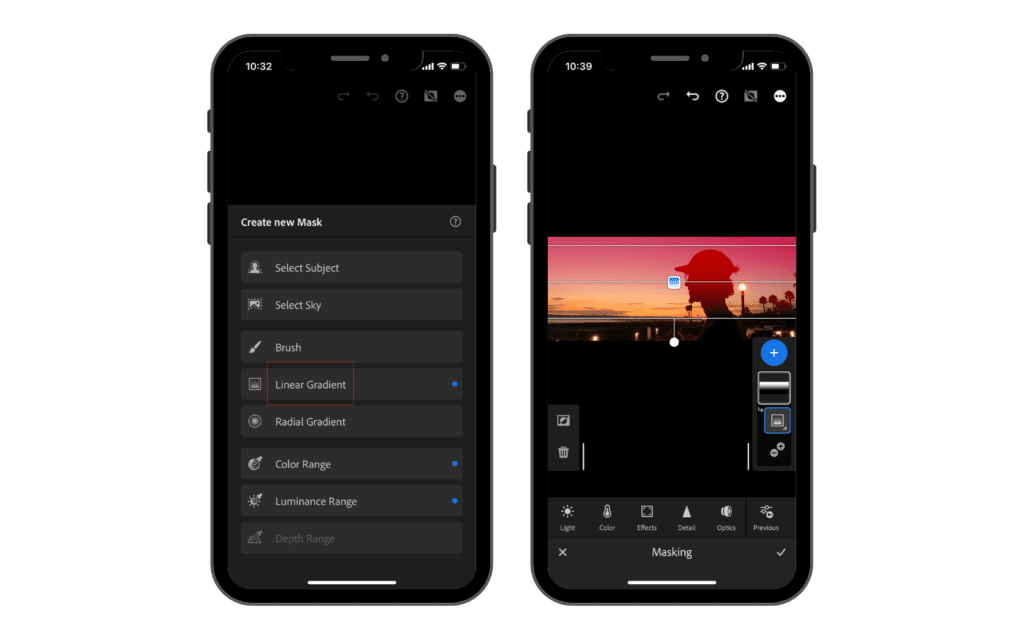
Below that, we have linear and radial gradients.
Let’s go ahead and tap Linear Gradient. Basically, it’s just going to bring a big wall if we tap and drag our finger down, and then we can let go and go ahead and bring our exposure down for example and only that area is going to be affected, but it’s slowly going to fade off and back into the normal photo.
Let’s go ahead and do the Radial Gradient now. It is going to be the same thing but in a form of a circle. We can tap and drag our finger and create any shape of a circle or oval we want.
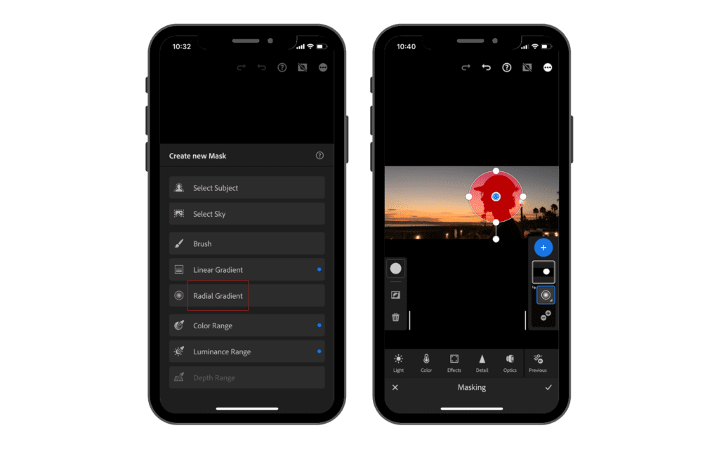
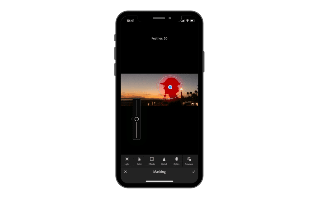
We can feather the edges and then the edits we make will only be affected in that area. This is a really nice tool for editing parts like faces or eyes.
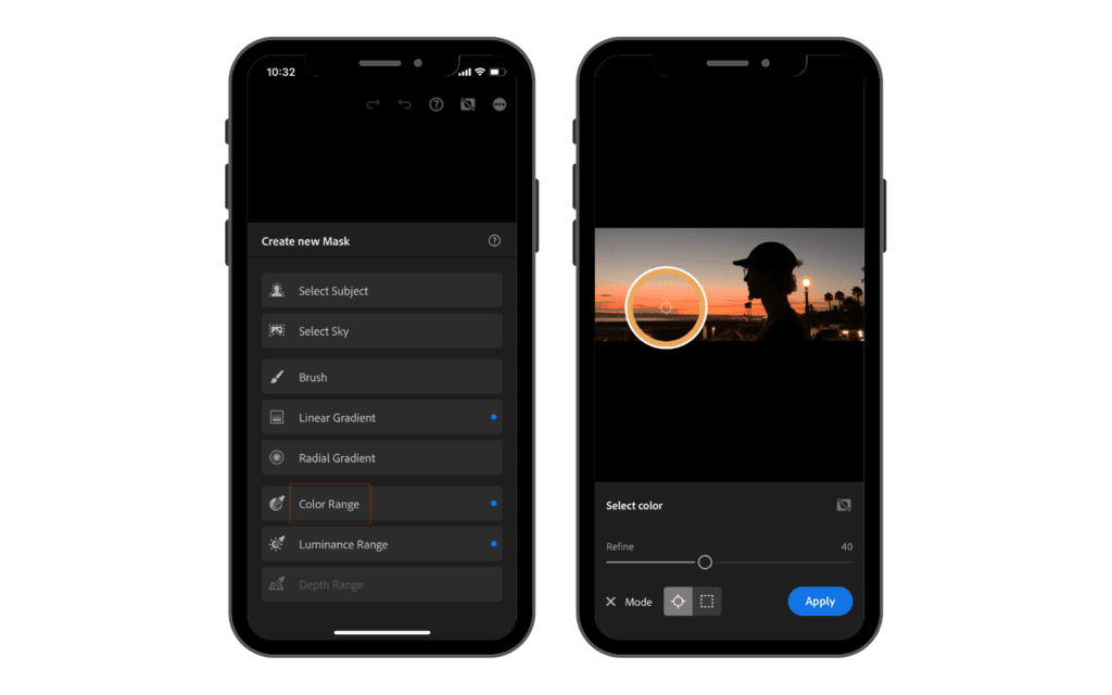
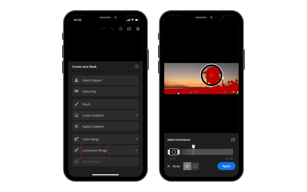
The next masking tools we have are Color Range and Luminance Range. They both do the same thing focusing on different parameters. Color range basically selects an area based on the color we select. Let’s say that we have a yellow flower in our photo, we can use this tool to select the yellow color and then all the adjustments we do are going to affect just the parts in our image that are yellow.
Luminance range does the same thing but focusing on brightness.
Masking layers can be a little confusing at first, but once you get the hang of them, they can really make a big difference in your photos.
Healing Brush, now called Remove
2023 screenshots below. Adobe renamed this tool Remove in 2024. Long press it to reach Heal and Clone; Generative Remove lives here too. It is a premium feature.
The next more advanced tool is going to be the healing brush, which is the icon that looks like a little bandaid.
So if we go ahead and tap that, we are going to see some settings where we can adjust the size, feather and opacity of this tool.

The healing and clone tools in Adobe Lightroom are two powerful editing tools that can help you create stunning images. The healing tool is used to repair small imperfections on an image, such as blemishes or dust spots, while the clone tool is used to copy pixels from one area of an image and paste them onto another.

The healing tool works by sampling a nearby pixel when it’s selected over a defect in an image, blending the colors for a seamless correction. It’s best used for minor imperfections like minor dust spots or blemishes.
On the other hand, the clone tool works by copying data from one part of your photo and pasting it onto another area that needs correction. This makes it perfect for removing large elements like power lines or unwanted objects.
Optics
2023 screenshots below. On the current app you tap Edit first, then Optics.
Now we can go back to the original order, and we have optics. So if we go ahead and tap optics, we have lens profile corrections, Remove Chromatic Aberration and Defringe.
If we enable Remove Chromatic Aberration, Lightroom looks for color fringing, the red or green halos that lenses leave along high contrast edges, and cleans it up. Optics is free, which several guides get wrong.
If we enable the second option, Lightroom will adjust any lens distortions created by a fisheye or very wide-angle lens.
These two tools are good to know but honestly won’t come in handy very often, especially if we are using our iPhone to capture our photos.
Geometry
2023 screenshots below. Geometry is no longer its own button; you now reach it through the Crop tool, on the Geometry tab.
The final tool we have is geometry.
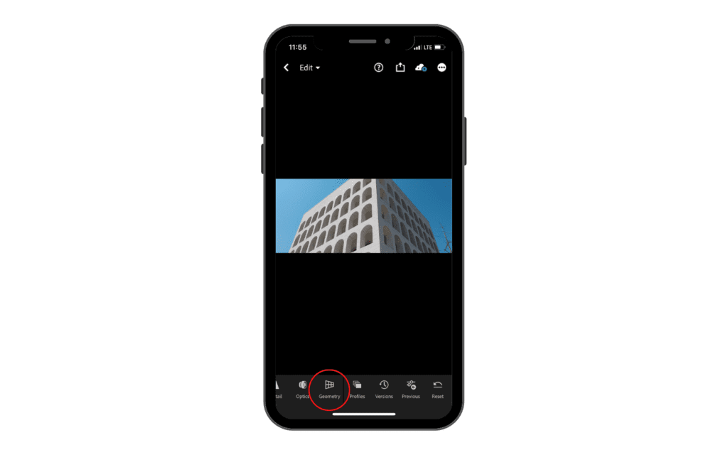
This tool helps us to manipulate the whole geometry of our photos.
The Geometry Tool also allows for more precise adjustments such as adjusting skew or rotation. These adjustments are essential for creating a level horizon or aligning objects within an image accordingly. Furthermore, Lightroom’s Geometry Tool also offers options like Horizontal Offset which can be used to balance elements within an asymmetrical composition.
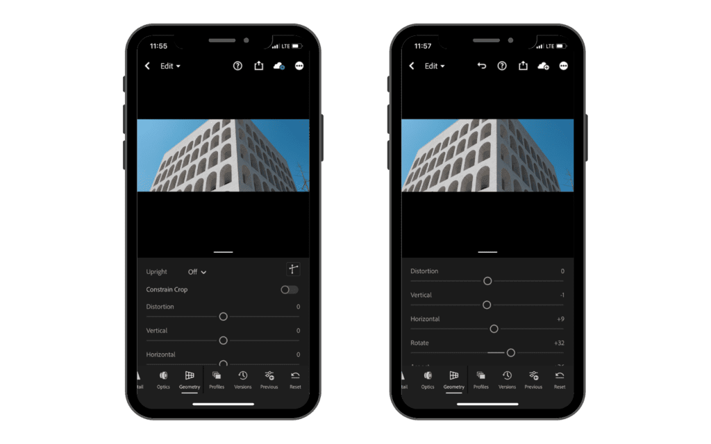
I see this tool as an adjustment tool rather than a creative tool.
How to Use Lightroom Mobile to Edit Photos, Step by Step
Getting Started with Your Edit
The before and after comparisons in this section are my own photographs, edited on the phone for this guide. They are the actual edit, not a demo file.
Now it is finally time to jump right into editing our photos.
Before starting to edit, I usually adjust the aspect ratio and crop the photo as I want it. After this step, I start editing it.

The first thing I want to show you is a simple and fast method I use to give my photos a boost before starting to edit them.
This method utilizes a tool we previously discussed which is in the bottom tool bar, is the auto tool.

In this specific case, I want to keep the photograph dark and moody and what the auto tool is doing doesn’t help me achieve this result. So I won’t start with this adjustment in this case.
So, the first thing we need to do is open the picture we want to edit, then click on the light tool and open the curve graph.
Now, we need to select every single red, green and blue channel and create a light S curve. To do so you have to make a point in the first half of the line and bring it down and then another point in the top half and bring it up. Doing so will create a curve that has the shape of an S.

Now I know what you are thinking. This is not looking good! But we are not done yet.
This photo has a good amount of red tones in the shadows and midtones. So what we can do to remove it is to use the tone curve and select the red channel. Once we select it, tap on the middle and drop down the curve slightly until the red disappears.

After this edit, some green tones will appear and in order to remove those we need to balance it by adding some blue tones. So, still using the tone curve tool, we select the blue tones, tap in the middle and slightly drag up until the photo balances out.

If we compare this image to the original one, we can see that the edit we did gave a very nice boost to the contrast and overall colors. They are not oversaturated, but they’re a lot more vibrant. Some of the shadows might be underexposed as well.
The next step we have to do is click the three little dots up in the top right hand corner and create a preset.
Lightroom is going to ask us what we want to include in the preset and we just want to make sure we have the light option checked because that’s where the tone curve is.
We need to name the preset as well. I usually keep it simple and call this one “Blue Tone Curve”.

I don’t use this on every photo because sometimes it doesn’t work well, but most of the time it is a really nice preset you can put on your photo to get started.
After, we can go ahead and adjust the other “light” settings. For this photograph, I wanted to keep the tones dark and moody, so I lower the shadows and increased a little bit just the highlights.

This is a before and after of what we have done so far.
At this point, we are ready to move forward with the color tool. Here I want to add some blue tones to the photo, keeping the skin tones of the subject as real as possible.
To do so I lowered the color temperature towards the blue tones slightly. Then I used the trick we discussed before, increasing the vibrance and lowering the saturation a little bit.

Now we need to bring back some color in the skin tones and to do so we have to tap on the color wheel. Here, we need to tap on the selector tool in the middle, select saturation and tap on the skin and drag up until the color is back a little bit.

Now we can do the same but with luminance. The subject is a little bit dark compared to the surrounding and I want it to pop more.

Now we can move to the effect tab and add a vignette to our photo. I like it to be subtle so I slightly drag it to the left.

I like to add a little bit of grain as well to give it a film look.

Next, I want to create a little mask around the subject and increase the luminance just to make sure the eyes go directly in the middle when someone is looking to this picture. To do so I will be using the masking tool.
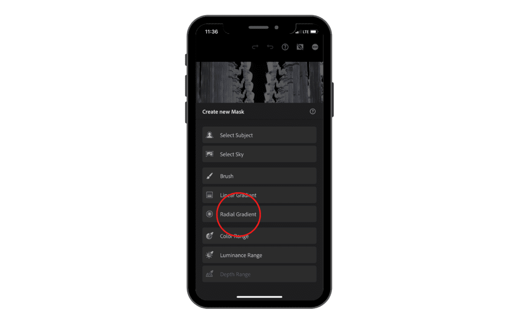
Tap on masking and then on the + icon. Then select radial gradient and create one around the subject. I like to feather it out as much as possible to make it very subtle.

Once we have done that, tap on light and then increase the exposure just a little bit. Then I moved to color and increase the saturation just a tiny bit as well.
As you can see, that is just a huge world of difference. The photo looks so much more alive and rich instead of the flat, raw photo we started with.
When you shoot in raw you have infinite possibilities when it come to edit your photos.
Create your own style
Creating your own unique style when editing photos is essential for creating a portfolio of images that stands out and is instantly recognizable. Editing each photo in your portfolio to fit the same style allows you to create a cohesive look and feel, which can make all the difference in how a viewer perceives your work.
Developing an individual style helps to ensure that you are not just mimicking other photographers’ works, but rather creating something truly original.
It takes time to discover what works best for you, as every photographer’s editing style is unique to their own vision and aesthetic. You must experiment with different techniques until you find the perfect balance of colors, saturation, contrast, sharpness and more that will make your photos truly “pop”.
Taking the time to figure out which tools are right for the task at hand can be very beneficial in the long run; by doing so, you’ll have an easier time achieving consistent results while still showcasing your individual style.
There are a few things that you can do to help develop your style a little bit quicker and find things in elements you like and incorporate them in the number one thing that you can do.
I know that I said that you shouldn’t mimic other photographers’ work, but if you just want to experiment and start seeing what is possible to create, it is good to take inspiration from someone’s work you already admire.
So if you’re on Instagram or on some sort of social media platform and you see a photo with a really nice edit that you really like, just try your best to copy that edit.
And if you are worried that you’re gonna be some sort of copycat and you don’t want all your photos to look exactly the same as everyone else’s, or like this person’s, and you want your own unique look to your photos, don’t worry, because it’s gonna be pretty much almost impossible to exactly nail the other person’s edit unless you’re using one of their presets.
One thing I used to do when developing my own style, was to take inspiration from several photographs, even from different photographers, and incorporate in my edit different elements that I saw in each photograph. In this way, I slowly created my own style, or better I discovered it.
The Copy & Paste Settings
Adobe counts copying and pasting edits between photos as batch editing, which is a premium feature. On the free tier the workaround is the next section: save the look as a preset and apply it photo by photo, which gets you the same consistency with one extra tap.
Copy and Paste in Lightroom is a powerful tool for you to quickly and easily apply your favorite editing styles from one image to another. With this setting, you can ensure consistency across photos, or simply save time by not having to start from scratch with each edit.
So, in order to copy and paste the edit of a photo, we need to go ahead and tap the three little dots up in the top right-hand corner, and then click on copy settings.

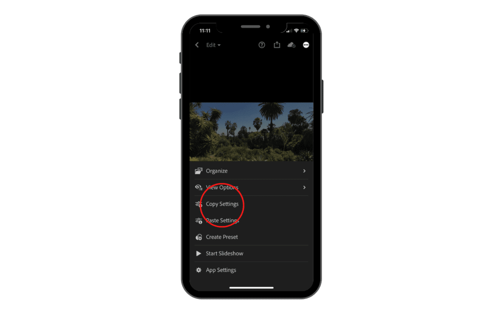
It is going to ask us what elements we want to copy. I usually never check the options for crop, healing, or masking because they always vary from photo to photo. The options that I always check to copy exactly the look of a picture without modifying the structure are: Light, Color, Effects, Detail and Optics.

We can go into even more in detail with our selection by clicking on every option that has a little arrow on the right side. If, for example, we click on the light option, we will be able to copy specific settings from the light tool rather than all of them.
Once we selected all the options we want to copy, we need to click on the checkmark in the top right-hand corner. It is going to say “Settings copied to Clipboard“.
Now, let’s go ahead and select another photo.
Let’s tap on the same three dots in the top right-hand corner and click on paste settings.
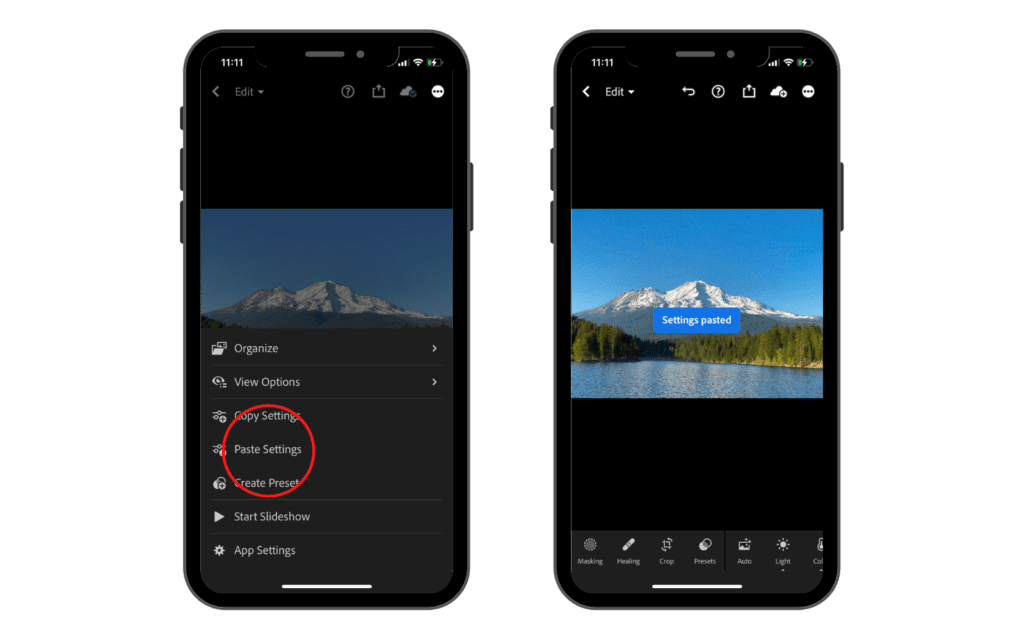
Now, this new photograph has the same settings we just copied from the other picture.
This is obviously a starting point because every photograph is different and therefore we need to adjust every setting to make the best edit possible.
Create and Save Your Presets
So once you get to a point where you have developed a style that you like and want to save it on your iPad, your phone or just in Lightroom (even Lightroom classic or lightroom cc), you can create your own presets.
I know I briefly showed you how to do this previously in the article but now I want to go more in detail about it.
Let’s take this photo right here for example. I have edited it and I want to create a new lightroom preset.

The first thing we need to make sure of is that we are in the editing window. Once we are there, we need to click the three dots on the top right-hand corner and select “create preset”.
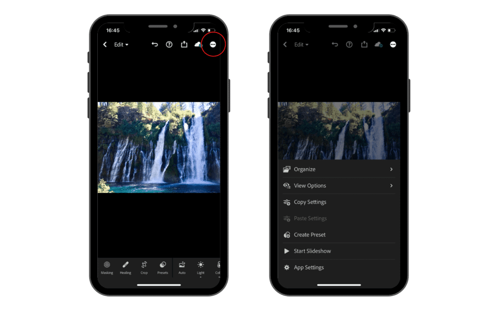
Then, it is going to ask us everything we want to include in this preset (like we did when we copied the settings). After we selected them, we can rename the preset and select a group to save it.
I like to be organized so I always create groups to save my presets so I know where to find the based on the photograph I am editing. I usually name it after the look I created.

Once you are happy with your selections, click the check icon in the corner and lightroom will create the preset and save it in the group you chose.
Import Lightroom Mobile Presets
If you also work on a computer, the same preset files install there in a slightly different way, which we cover in our guide to adding presets to Lightroom.
If you really like a photographer’s work and you can’t figure out by yourself how the edit was done, you can buy and import a preset into lightroom very easily (if the photographer made it available to the public of course).
The method to import presets into Lightroom mobile is different from importing them into the desktop version.
The first thing we will get when we purchase a lightroom preset package for mobile is a .DNG file.
DNG is a digital file format that stores raw image data. This means that, in our example, all the edit information are going to be stored in that file as well.
Once we get the DNG file, the first thing that we need to do is import it to our camera roll.
You can do so by importing it to Google Drive first and then saving it to your phone.
On the camera roll, it is going to appear as a white image since it won’t be able to read such a format. But don’t worry because the image is there and we just need to import it inside Lightroom.
To do so, just go to the library tab in the app and click on the blue icon in the bottom right hand corner with the + sign.
Select the image from your camera roll and then import it.
Once the image is imported, open it in the editor tab like you would normally do to edit and picture. Then click the three dots in the top right corner and select “create new preset“.
Select all the options as we discussed before and click the check icon in the corner.
Once you do that you will have successfully imported a preset from a DNG image. You need to do the same process for every preset you want to import. I would suggest creating a specific group for every photographer’s presets you are adding in order to keep things organized.
Tips and Tricks
Before the settings: editing rescues a good photo, but it does not rescue a badly shot one. If your results still feel flat after a careful edit, the fix is usually further upstream, and these tips on how to take better pictures will move the needle more than any slider. If you are weighing Lightroom against a desktop alternative for serious work, we compare Capture One and Lightroom too.
A note on the tips below: ratings and flags now sit behind the three-dot overflow menu, under Info and Rating.
Now I want to go over a few helpful tips and tricks you might find helpful while using Lightroom that you may not have known about and that will make your editing experience much easier.
If you are editing a photo, you can simply tap and hold your finger on the screen and it will show you the original version so you can see how much your edit has affected your photo. Then simply just let go and it will throw your edit back on. You can repeat this as often as you want to check the progress of your edit.
Next, when you export a photo, you have the option to add a watermark. One caveat before you try it: watermarking on export is a premium feature now, so on the free tier you will see it offered but locked. So, if we go ahead and export a photograph, in the export window there is going to be an option we can check to include a watermark. Just tap that little check and then we can go ahead and come down to customize. It is going to ask if you want to add text or a graphic.

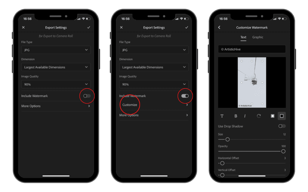
If you want to add a graphic, click on the tab that says graphic on top and then you will be able to choose a file from your computer or phone (such as a logo for example). You can choose to add text as well by clicking on the text tab on top and customizing the text you want to appear on the photograph.
Another handy tip is about metadata. If we go and tap the little dropdown icon where it says edit up in the top left, and then tap on info, it is going to show us all the information about the photo. In particular, when we took it, what camera we took it with, the shutter speed, ISO, etc…
While we are here, you can see this row of five stars. These are used to rate your photographs. This is really helpful because when you are going through all your photos for the first time you can rate them and then sort them by rating and you will be able to see all the best photographs you took right away.

Finally, If we go ahead and tap the three little dots, you can tap on start slideshow, and basically, it is going to start a little slideshow of all your photos in whatever album you are in.

Conclusion
In conclusion, Lightroom is an advanced mobile editing app that provides users with a wealth of features. This app makes it easy for anyone to take their photos to the next level. With its creative tools and intuitive interface, Lightroom can quickly transform any image into something truly stunning.
Using Lightroom as an editing app has many advantages. It offers a comprehensive set of professional-grade tools that allow you to make adjustments and apply effects with ease. Furthermore, its well-designed interface makes it simple for anyone to navigate the various settings and get your desired look in no time at all.
Finally, there is cloud storage. A free account now gets 5GB and can share public albums by link or QR code, while syncing a library across phone, tablet and desktop needs a paid Adobe plan.
If you want to improve the quality of your photos, check out our free iPhone Photography guide!
What Adobe added after these screenshots were taken
The walkthrough above covers the panels that do the heavy lifting, and those have not changed. Adobe has added a lot since early 2023, and some of it is useful. What is missing from the walkthrough:
- Quick Actions (the wand icon). One-tap edits that use AI to find the subject, sky or background for you, plus auto-enhance, angle straightening and blemish removal. This is now the fastest route to a decent edit, and the biggest single change to the interface.
- Generative Remove. Removes power lines, signs and objects from complicated backgrounds far more cleanly than the old healing tool managed. Premium, and it draws on generative credits.
- Lens Blur. Depth-aware background blur with selectable bokeh shapes. Premium.
- Adaptive Presets. Presets that target the subject or the sky rather than the whole frame, a real step up from the presets covered earlier. Premium.
- Denoise and Super Resolution. Adobe’s newer noise reduction rebuilds detail instead of smoothing over it, so the caution in the Detail section applies to the old slider, not to Denoise. Check in the app whether your tier includes it.
- Point Color. A more precise way to target one specific color than the Color Mix sliders allow.
- HDR editing and export. Bright highlights hold detail on displays that support it.
- Video editing. The app trims clips and applies the same Light, Color, Vignette and Grain adjustments, plus presets, to video.
- Film-inspired presets and profiles, added in 2026. They are a much better starting point for a filmic look than pushing sliders from scratch.
- Free public album sharing. Since late 2025 you can share an album by link or QR code on the free tier, using the 5GB of cloud storage a free account now includes.
None of that invalidates what you learned above. Quick Actions is a shortcut to the same adjustments, and the generative tools are additions to the toolbar rather than replacements for it. If you understand what the Light and Color panels do, you can use all of it.
Lightroom mobile cheat sheet: every slider on one page
There is no PDF to download here on purpose. Use your browser’s Print command on this page and choose Save as PDF, and you get the same thing on your own device with nothing to download and no email required. Keep this beside you while you edit, because your phone is busy running Lightroom.
| Slider | What it does | Reach for it when | Tier |
|---|---|---|---|
| Exposure | Brightens or darkens the whole photo | The image is globally too dark or too bright | Free |
| Contrast | Widens or narrows the gap between darks and lights | The photo looks flat and lifeless | Free |
| Highlights | Recovers or pushes the brightest areas | A sky is blown out and needs detail back | Free |
| Shadows | Opens or deepens the darkest areas | A backlit subject is too dark | Free |
| Whites and Blacks | Sets the true white and black points | You want a full tonal range with real punch | Free |
| Tone Curve | Gives precise control over any tonal range | Sliders are too blunt, or you want a faded film look | Free |
| Temp and Tint | Warms, cools or corrects a color cast | The white balance looks wrong | Free |
| Vibrance and Saturation | Vibrance protects skin tones; Saturation hits everything | Color needs lifting. Prefer Vibrance on people | Free |
| Color Mix (HSL) | Adjusts one color at a time | Only the sky, or only the greens, need work | Free |
| Texture | Emphasizes medium detail | Skin or foliage needs definition without harshness | Free |
| Clarity | Adds local contrast and bite | The photo needs presence. Go gently on faces | Free |
| Dehaze | Cuts through atmospheric haze | A landscape looks milky or flat | Free |
| Vignette | Darkens or lightens the frame edges | You want the eye pulled to the center | Free |
| Grain | Adds film-like texture | A file looks too clean, or you want a film feel | Free |
| Sharpening | Crisps up edges | Every photo wants a touch at the end, but it cannot rescue soft focus | Free |
| Noise Reduction | Smooths high-ISO speckle | You shot in low light. Watch for mushy detail | Free |
| Optics | Fixes lens distortion and color fringing | Straight lines bend, or edges show color halos | Free |
| Masking | Applies any adjustment to part of the frame | Only the sky, or only the subject, needs the change | Paid |
| Remove, Heal, Clone | Takes objects and blemishes out | Something in the frame has to go | Paid |
| Geometry | Straightens converging verticals | Architecture leans, or horizons need squaring | Paid |
If you only want the table rather than the whole guide, select it first, then print the selection.
Frequently Asked Questions
What is Lightroom mobile?
Lightroom mobile is Adobe’s free photo editing app for iPhone, iPad and Android. It edits raw and JPEG files using the same panels as the desktop version, includes its own camera, and syncs to Lightroom on desktop and web if you pay for a plan.
How do I get started in Lightroom Mobile to edit photos like a pro?
Download Lightroom from your app store, then sign in with your Adobe account or create a free one. Import a few photos, then start with Exposure in the Light panel and white balance in Color. Both panels are free, and they do most of the work in a typical edit.
Can I sync my photos in Lightroom Mobile across all my devices?
Syncing across devices needs a paid plan. A free account now includes 5GB of Adobe cloud storage and can share public albums by link or QR code, but keeping your library and edits in step across phone, tablet and desktop is a subscription feature.
What are Lightroom presets and how do I use them in my mobile app?
Lightroom presets are pre-determined settings applied to photos for quick editing. To use them in Lightroom Mobile, you can either create your own by saving the current editing settings or download and import preset packs. Apply them by tapping on the ‘Presets’ option at the bottom corner of the screen and selecting your desired preset.
How can I take advantage of the Lightroom Camera within the app?
The Lightroom Camera is a built-in camera app that allows you to capture photos while taking advantage of Lightroom’s powerful editing features right at the moment of capture. To use the Lightroom Camera, open the Lightroom Mobile app, and tap on the camera icon at the bottom right corner of the screen. This enables you to adjust settings like exposure and focus before taking the photo.
Is it possible to do batch editing for my photos in Lightroom Mobile?
Yes, but it is a premium feature. You copy the settings from one photo and paste them onto others, which is the fastest way to make a set of images look consistent. On the free tier you can still save your look as a preset and apply it photo by photo.
What should I do if I want to transition my editing workflow from Lightroom Mobile to Lightroom Desktop?
Turn on sync with a paid plan, and your albums and edits appear in Lightroom on the desktop, where you get more precise control and a properly calibrated screen. If you use Lightroom Classic instead, note that it works differently and only synced collections travel. Worth knowing: a Premium purchase made inside the mobile app does not unlock the desktop apps.
Do I need a Lightroom subscription to use all the features in Lightroom Mobile?
Yes, for part of the app. Free covers the whole global adjustment stack: Light, Color, Effects, Detail, Optics, the Tone Curve, cropping, presets, the in-app camera including raw DNG capture, albums, export, and HDR and video editing. A paid plan unlocks anything that targets part of the frame or generates pixels: masking and selective adjustments, Remove, Heal and Clone, Generative Remove, Lens Blur, Geometry, Adaptive Presets, batch copy and paste, raw import from a camera or card, watermarking, and syncing with more than 5GB of storage. One thing to watch: a Premium purchase made inside the app unlocks premium features on mobile and on the web, but not the desktop apps. For those you need an Adobe plan. Prices change, so check Adobe’s site, and note that the AI features draw on a monthly allowance of generative credits.
Why does the app on my phone not match the screenshots?
Because the screenshots were taken in early 2023 and Adobe redesigned the mobile interface later that year. The panels and sliders are the same; the buttons that open them moved. The interface note near the top of this guide maps every path that changed.
Is there a Lightroom mobile tutorial PDF?
Not as a download, and that is deliberate. Adobe updates this app most months, so a PDF saved to your drive is out of date almost immediately, which is exactly what happened to the old Lightroom PDFs still circulating. Use your browser’s Print command on this page and choose Save as PDF and you get the same thing, on your own device, from a page that gets corrected. The printable cheat sheet above is the part to keep.